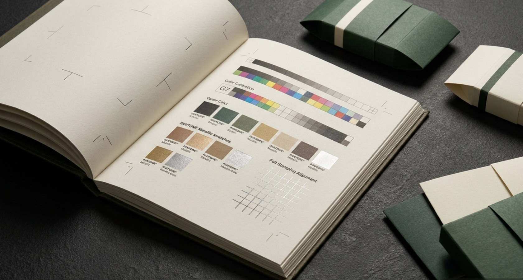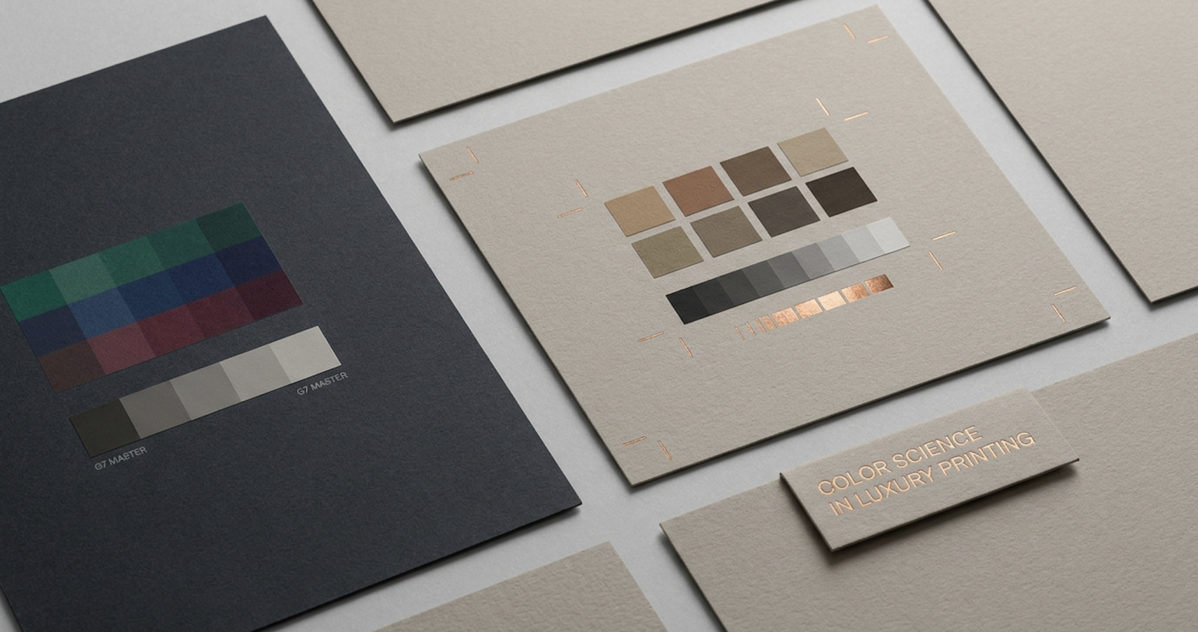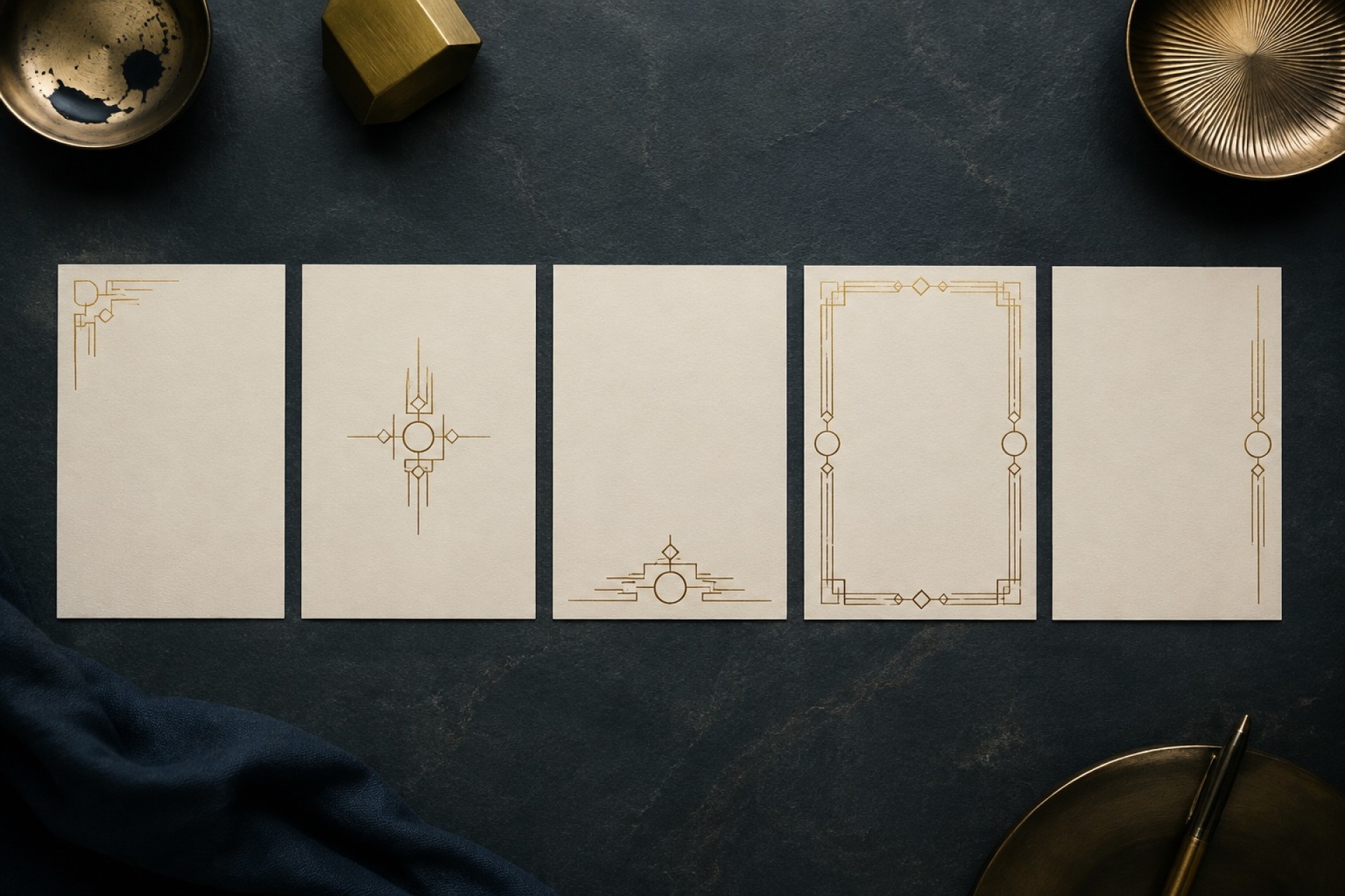
對國際精品與高訂品牌而言,包裝紙材的更換往往意味著色差風險的增加。當同一組品牌代表色從金銀箔紙、塗佈銅版紙轉移至粗糙的非塗佈美術紙時,如何確保全球消費者觸摸到的視覺彩度完全一致?
不論客戶選擇溫潤的大地質感紙張或是高光澤金屬卡紙,豐格皆能透過 G7 數據精準補償,實現「不同紙材、接近色相」的跨介質無瑕對齊,為精品品牌捍衛一致的視覺靈魂。
[Color Science] G7 Master Standard: Transcending Substrate Boundaries for Absolute Cross-Media Alignment
For global luxury and bespoke houses, transitioning between different packaging substrates often amplifies the risk of color variation. When an iconic brand shade shifts from metallic foil cardstock or coated paper to textured, uncoated art paper, how do you ensure identical visual saturation across global touchpoints?
Whether selecting tactile earth-toned art paper or high-luster metallic board, FONGUE uses G7 data calibration to achieve seamless cross-media parity—safeguarding the visual soul of global luxury brands.
在每小時動輒上萬張的高速印刷產線上,微小的墨滴飛濺、版面刮痕或微幅色差,都可能損害精品的完美形象。豐格如何告別傳統抽檢模式,達成真正的「100% 全數可追溯品質」?
全廠 AI 智慧放墨系統 豐格全廠印刷機台皆配置 Komori AI 智慧控墨系統(KHS-AI / KHA-AI)。在印前階段,系統自動讀取 CTP 數位晒版數據與 PDF 原始檔,預先精準計算各墨區所需放墨量,搭配 PDC-SX 光學自動色彩掃描儀進行閉迴路控制,大幅縮短開機校色時間,實現開機即精準的對位與密度掌控。
PQA 鷹眼連線品檢:每小時 18,000 張的高速即時防線 進入量產階段後,機台搭載的 PQA 鷹眼連線品檢系統 正式啟動:
100% 張張攝影監控: 以每小時高達 18,000 張 的極速攝影機,對每一張印件進行全幅比對。
即時瑕疵攔截: 取代傳統人眼放大鏡抽查,系統能瞬間捕捉髒點、刮版、飛墨與細微色差。
數據化品質建檔: 檢測數據即時連線建檔,建立可追溯的品質履歷,確保交付至客戶手中的每一份包裝製品皆符合「一張不差」的零瑕疵標準。
[Industry 4.0] AI Digital Ink Control & PQA Inline Inspection: Data-Driven Zero-Defect Line of Defense
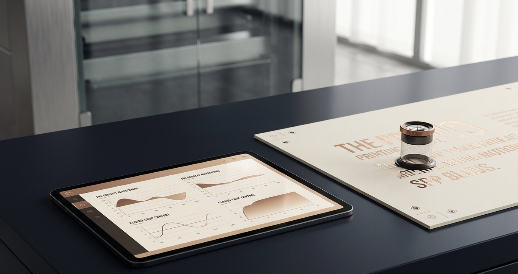
當永續發展(ESG)成為全球精品與高訂品牌供應鏈審核的核心指標,傳統印刷的高 VOCs 揮發物與高能耗製程已難以為繼 。豐格如何在提供極致感官奢華的同時,堅定實踐綠色減碳承諾?
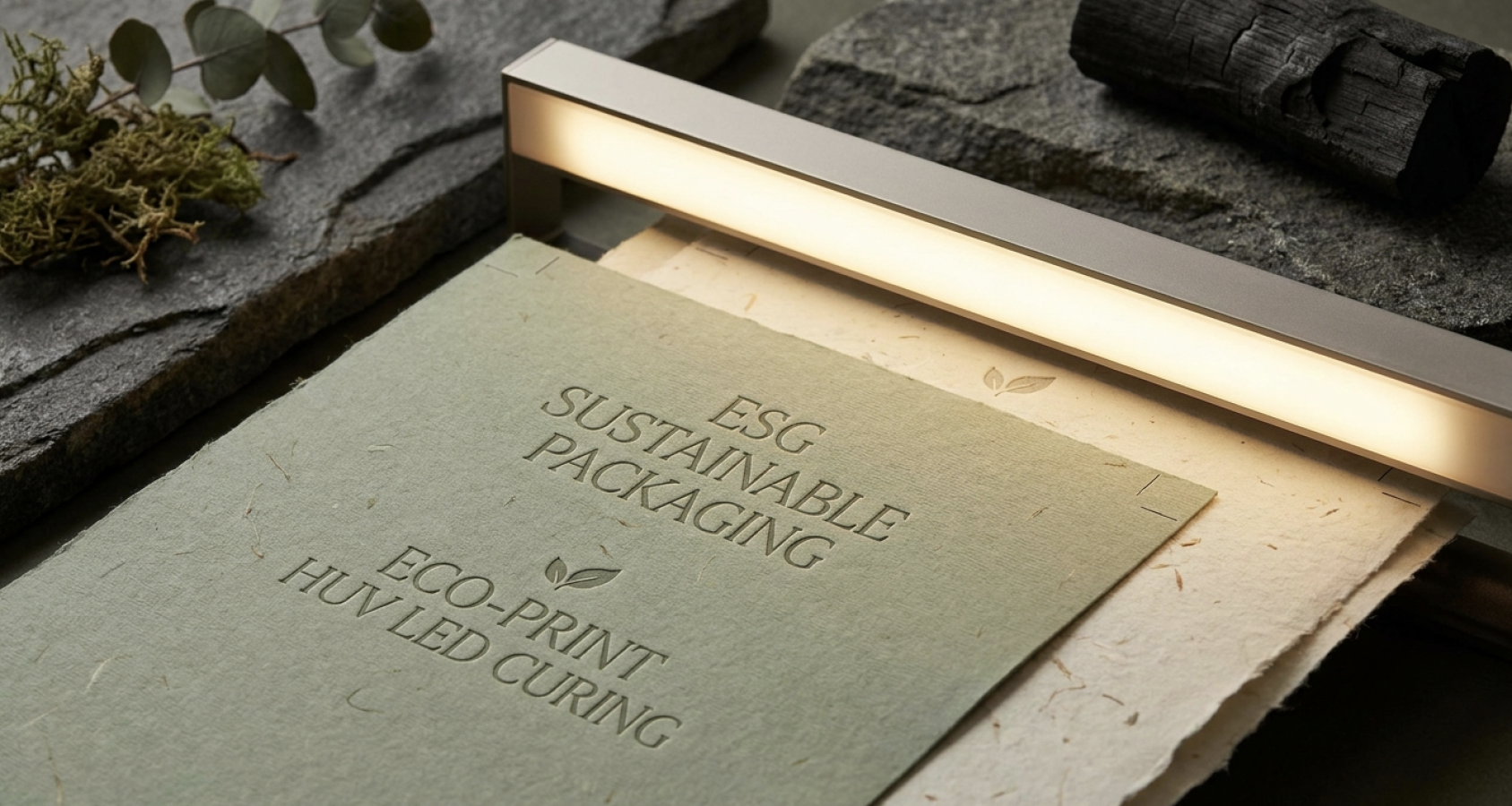
Komori HUV / HUV-LED 綠能印刷技術 豐格全面引進日本小森 Komori Lithrone 8 色與 5 色水性連線上光綠能印刷機組 。這套先進的綠能系統帶來突破性的技術優勢:
VOCs 揮發物趨近於零: 採用特殊的 HUV 節能固化技術,有機揮發物(VOCs)排放量低於 0.8%,遠優於傳統油墨與植物油墨標準。
瞬間乾燥與雙倍彩度: 印件經過 HUV/LED 光源照射瞬間乾燥,免除噴粉污染;更可以在美術紙、塑料與金銀箔紙上呈顯雙倍飽和的立體彩度。
無臭氧與節能減碳: 低熱量、低能耗的發光特性,大幅降低生產過程中的碳足跡。
全流程永續實踐(ISO 14064-1 & 環保紙束帶) 綠色承諾不只停留在印刷機台 。豐格完成 ISO 14064-1 溫室氣體盤查 ,並在出貨階段採用環保「紙束帶」定量分包(全面棄用橡皮筋以保護印件紙角);搭配無壓痕防護包裝與可追溯標籤。從科技控墨到綠色物流,讓品牌客戶在追求極致質感的同時,無縫攜手實踐企業社會責任 。[Green Craft] HUV / HUV-LED Eco-Printing: The Harmony of Quiet Luxury & ESG SustainabilityAs Environmental, Social, and Governance (ESG) criteria become paramount in global luxury supply chain audits, traditional high-energy, high-VOC printing methods are no longer viable. How does FONGUE deliver ultimate tactile luxury while upholding steadfast eco-sustainable commitments?
Komori HUV / HUV-LED Eco-Printing Machinery FONGUE deploys state-of-the-art Komori Lithrone 8-color and 5-color inline water-based coating presses, delivering game-changing environmental benefits:
Near-Zero VOC Emissions: Utilizing high-efficiency HUV energy-saving curing, Volatile Organic Compound (VOC) emissions are kept under 0.8%, far outperforming conventional oil-based standards.
Instant Curing & Double Saturation: Printed sheets dry instantly under HUV/LED light source without anti-setoff powder, rendering vivid, high-chroma saturation across art papers, synthetics, and metallic boards.
Ozone-Free & Energy Efficient: Low-heat, energy-saving light sources significantly diminish the overall carbon footprint across production cycles.
Total End-to-End Sustainability (ISO 14064-1 & Eco Paper Banding) Eco-responsibility extends beyond the pressroom. FONGUE has completed ISO 14064-1 Greenhouse Gas (GHG) Accounting and implements eco-friendly paper banding for batch bundling (eliminating rubber bands to prevent edge damage). Combined with protective packaging and batch traceability, we empower luxury houses to fulfill their corporate social responsibility without compromising sensory perfection.
在國際精品包裝的殿堂裡,完美的成品從不來自偶然,而是源自印前、印中至交付階段每一個毫釐細節的嚴苛控管。當設計藍圖轉化為實體製品時,如何預先排除紙材伸縮、色彩落差與後加工對位誤差?豐格整理出國際精品級的「印製生產規範」,為品牌奠定零瑕疵的極致品質防線。
1. 印前色彩與 CRPC 色域預判 (Prepress Color & Gamut Alignment)
G7 色域精準校準: 針對非塗佈美術紙,設計端應預先設定 CRPC 3 色域 進行彩度補償;若選用塗佈金銀卡紙,則對齊 CRPC 6/7,避免紙張吸墨特性導致色彩落差。
Pantone 專色與 CTP 預測: 大面積滿版色塊建議標註指定 Pantone 專色號,並透過 CTP 數位晒版數據預先輸入 AI 智慧控墨系統(KHS-AI),實現開機即達標的放墨精準度。
2. 特殊紙材與複合後加工對位 (Substrates & Finishing Calibration)
微觀對位容許度: 高精度燙金與無色壓紋交疊處,圖案細線建議不小於 0.15mm,並預留 1–2mm 的對位咬紙容許度,防止極致包裝出現溢邊或模糊。
紙張絲向力學 (Paper Grain Direction): 彩盒軋型與折線方向必須與紙張纖維絲向保持平行,從力學源頭杜絕折角處發生紙面爆裂或折痕不平整。
3. 滿版印刷與水性防護層 (Solid Printing & Protective Coatings)
HUV 瞬間乾燥技術: 面對大面積深黑或高飽和滿版印刷,採用 HUV/LED 製程可達到光照瞬間固化,徹底免除傳統噴粉污染與印件沾黏風險。
水性連線上光保護: 建議搭配水性光油或抗刮護膜,提升包裝表面的耐磨損程度,護航精品包裝在跨國物流運送中的無瑕狀態。
4. 綠能物流與數據化驗收 (Eco-Logistics & Traceable Delivery)
無痕紙束帶分包: 出貨全面採用環保「紙束帶」定量捆紮(全面淘汰橡皮筋),徹底避免壓傷包裝邊角,兼具 100% 可回收性。
數據化品質履歷: 每批成品皆附有 PQA 鷹眼品檢數據貼標 與外箱責任履歷,實現全流程可追溯的國際驗收標準。
[Quality Excellence] Luxury Production Guidelines: Zero-Defect Standards from Prepress Gamut to Eco-DeliveryIn the realm of global luxury packaging, flawless execution is never an accident—it is the result of meticulous calibration at every stage from prepress to final delivery. When translating design concepts into physical objects, how do you mitigate substrate expansion, color shifts, and finishing alignment errors? FONGUE outlines these luxury production guidelines to establish an uncompromised line of quality defense.